About Me
I design products that feel obvious to use, because the best interface is one the user never has to think about.
15+
Years crafting digital products
UI/UX Designer & Frontend Developer
Based in Kochi, Kerala, I'm a Google Certified designer who blends design thinking with clean code. My work spans UI design, branding, and development, always with a focus on clarity, purpose, and beautiful execution.
300+
Clients served worldwide
My Design Process
How I turn problems
into polished products
Every project starts with curiosity and ends with clarity. Here's the repeatable framework I use, whether I'm redesigning a checkout flow or building a product from scratch.
Discover
Kick off every engagement by immersing in the business context, stakeholder interviews, competitor audits, analytics review, and a first look at existing user feedback.
Define
Synthesise findings into a clear problem statement and success metrics. I map user journeys and agree on scope before a single pixel is drawn.
Ideate
Generate a broad range of concepts through sketching, crazy-eights, and reference exploration, then narrow down to the most promising directions with the team.
Prototype
Build interactive Figma prototypes at the right fidelity for the question being tested, lo-fi for layout, hi-fi for interaction and visual feel.
Test
Run usability sessions, gather quantitative feedback, and iterate rapidly. Every round of testing tightens the design and reduces risk before dev handoff.
Deliver
Hand off design systems, annotated specs, and assets. Stay involved during development to QA and close the loop, launched ≠ finished.
New Problem Approach
How I tackle an
unfamiliar challenge
Facing a blank slate isn't a blocker, it's a signal to ask better questions before reaching for Figma.
Start with questions, not solutions
Before sketching anything I define what success looks like, who's affected, and what constraints exist. This prevents solving the wrong problem elegantly.
Study what already exists
Audit the current experience end-to-end, review analytics data, and benchmark against competitors to understand the gap between today's reality and the desired outcome.
Talk to people who live the problem
Even a handful of 20-minute user conversations surfaces insights that weeks of assumption-making miss. Empathy before aesthetics, always.
Restate the problem clearly
Write a focused "How Might We" statement that captures the user need without prescribing a solution, then use it as the north star for all design decisions.
Research & Discovery
How I understand users
and surface pain points
User Research
Methods I use to understand real people
- User interviews— open-ended 1:1 conversations to uncover goals, frustrations, and mental models.
- Surveys— quantitative validation of patterns seen in interviews at scale.
- Contextual observation— watching users in their natural environment to catch behaviour they can't articulate.
- Analytics review— heatmaps, session recordings, and funnel data to see where people actually drop off.
- Card sorting & tree testing— reveals how users expect information to be organised before any UI is built.
Pain Point Identification
Turning observations into diagnosed problems
Feature Prioritization
How I decide what
gets built first
Saying yes to everything is saying no to quality. I use a structured lens to cut through opinion and focus effort where it matters most.
Primary framework
Impact × Effort Matrix
Features are plotted by the value they deliver to users against the cost to implement. High impact, low effort items ship first, every time.
Anchor to user goals
Every feature candidate is tested against the validated user need. If it doesn't move users closer to their goal, it doesn't make the list.
Weight by evidence, not opinion
Frequency of the pain point in research + business impact score + technical complexity = a defensible priority ranking, not a HiPPO decision.
Align with business constraints
Timeline, team capacity, and strategic goals shape what's viable. I work with stakeholders to balance ideal and achievable without losing user value.
Validate before committing
Before investing in full design and build, I push for low-cost experiments, a prototype test or a fake-door A/B, to confirm the feature is worth its slot.
Tools &
Technologies
A curated stack built up through shipping real projects, every tool earns its place.
Tools
Tech
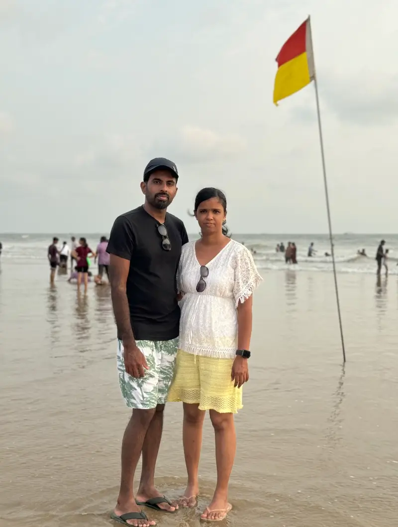
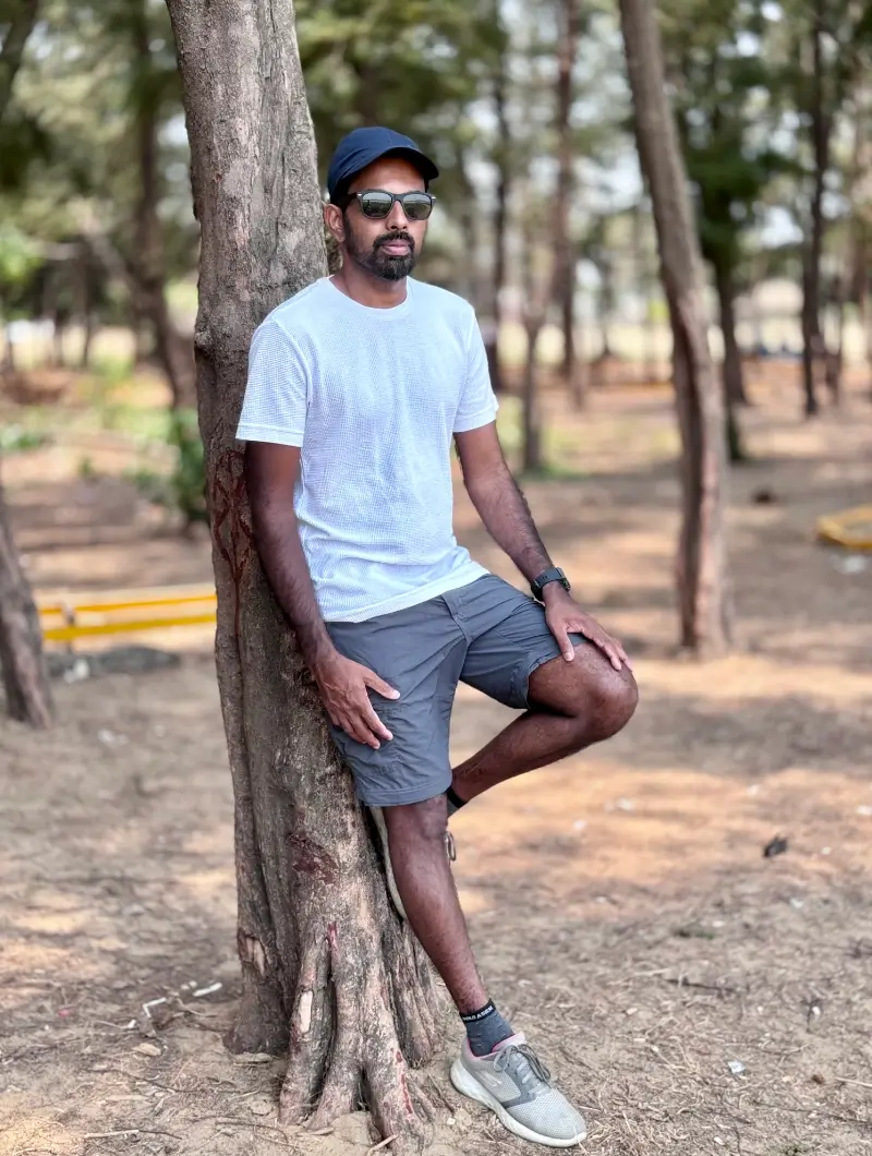
Life Beyond Work
A few family moments and everyday selfies
A personal gallery from life outside work, simple selfies, family time, short trips, and the moments I like to keep close.